Arabic / the root
مِزَاج
mizāj
The root concerns mixing. Mizāj also names the bodily and psychological qualities that distinguish a person.
Cairo Arabic Language Academy ↗A HOUSE OF CULTURE
A house of culture, built around music and the people who keep it moving.
Our story, the word behind the name, the references behind our colors, and things to carry with you.
Explore the merch01 / OUR STORY
A house for the people who make culture, the people who gather around it, and the people who keep it moving.
Find your next night out. Hear an artist from across the world. Make a gathering of your own happen.
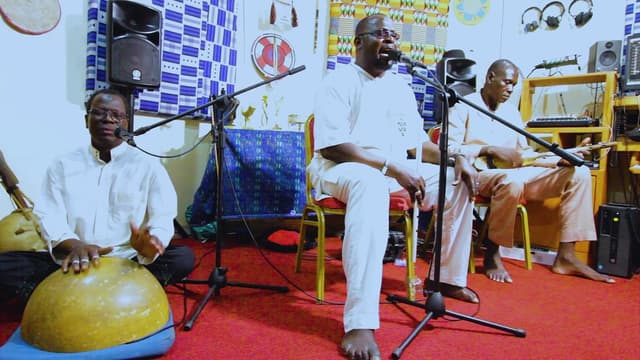
Our mission is to support musicians and sustain music cultures through new work, exchange, and collaboration across borders.
That takes both an audience and the means to keep creating. Mezaj connects live events, recordings, practical tools, and shared funding.
Our artist-curated program began in 2020 with musicians in India. After performing, each group was invited to choose the next artists. Those artists invited others in turn.
That chain of invitations grew across Africa, Asia, Europe, and the Americas. Musicians shape the program and introduce listeners to one another’s work.
Meet the musicOrganizers use Mezaj to sell tickets, offer memberships, and stream events. Mezaj contributes 33% of the fees from its ticketing and membership tools to the Universal Creator Income Fund.
Together with direct support from patrons, the fund backs artist-curated Sessions, independent releases, and collaborative live and streamed events.
This house is dedicated to a listener who heard two musicians playing in a New York subway station. He crossed to their platform, thanked them, and offered the change he had.
That act of generosity is the spirit behind Mezaj: people making it possible for other people to keep making music.
Read the founding story02 / THE NAME
مزاجমেজাজ
Mood · temperament · disposition
The character
you bring to life.
A word for your state of mind, your nature, your particular way of being. Sometimes good spirits. Sometimes a little fire.
For us, Mezaj is an invitation to bring that character into the room—and make room for someone else’s.
Follow the wordA voice from Bengal
মেজাজটাই তো আসল রাজা।
আমি রাজা নই।Mejaj tai toh ashol raja. Ami raja noi.
“Mood is the true, original king.
I am not the king.”
In the song, swagger and extravagance meet questions about hunger and inequality.
Languages in conversation
The Silk Roads carried more than goods. Across land and sea, people exchanged ideas, sounds, and words. Mezaj belongs in that wider imagination of encounter.
The word’s Arabic origins are documented. So are the centuries of Persian influence on Bengal. Related forms also appear in Hebrew, Uzbek, and Malay, with meanings shaped by each language. Its exact journey between languages is less certain: this is a story of connections, rather than a single mapped route.
UNESCO · The Silk RoadsArabic / the root
mizāj
The root concerns mixing. Mizāj also names the bodily and psychological qualities that distinguish a person.
Cairo Arabic Language Academy ↗Persian & Urdu / shared vocabulary
mezāj / mizāj
In Persian and Urdu, the word carries senses of constitution, temperament, and disposition. Pronunciation and usage have their own local lives.
Bengali / an everyday word
mejaj
State of mind. Nature. Temper, too. Bengali gives the Arabic-origin word its own sound and a place in ordinary conversation.
Accessible Dictionary, Bangladesh ↗Hebrew / the weather
mezeg / mezeg avir
In Hebrew, mezeg avir means weather—literally the temperament of the air. We like to think of it as the mood of the sky.
Learn Hebrew · Mezeg avir ↗Uzbek / character
mijoz
Mijoz can mean temperament or character: a person’s particular nature. The word has a home in Uzbek too.
Uzbek educational corpus ↗Malay / temperament
mizaj
Mizaj names temperament in traditional Malay thought. For us, it connects to what we call a vibe today—the feeling in “you’re killing my vibe.”
Malaysia · Department of Culture and Arts ↗And Bengal? Persian was a language of administration and literary exchange for centuries. Its contact with Bengali left a lasting vocabulary. That history includes migration, scholarship, and maritime connections as well as overland travel.
Richard M. Eaton · Encyclopaedia Iranica ↗In company & in verse
Expressions that make room for warmth, attention, and another person’s state of mind.
An Urdu expression
Cheerful. Of a pleasant disposition. The person whose good spirits are part of their character.
Meaning in Rekhta ↗An Urdu expression
Asking after someone’s wellbeing. A word for the small, human act of finding out how another person is.
Meaning in Rekhta Dictionary ↗A couplet / Urdu
آپ نے جو مزاج پرسی کی
آپ کی یہ بڑی عنایت ہے“You asked after my wellbeing;
that was very kind of you.”
What it means here
Come as you are.
Leave with a little
of someone else.
03 / THE COLORS
A bone flute, the pale center of mammoth ivory, and a Lee Krasner painting helped us find the palette.
The worn bone of the Divje Babe flute set the direction. The pale center of mammoth ivory gave us our Ivory cream. Together, these references connect the palette to the deep history of making music.
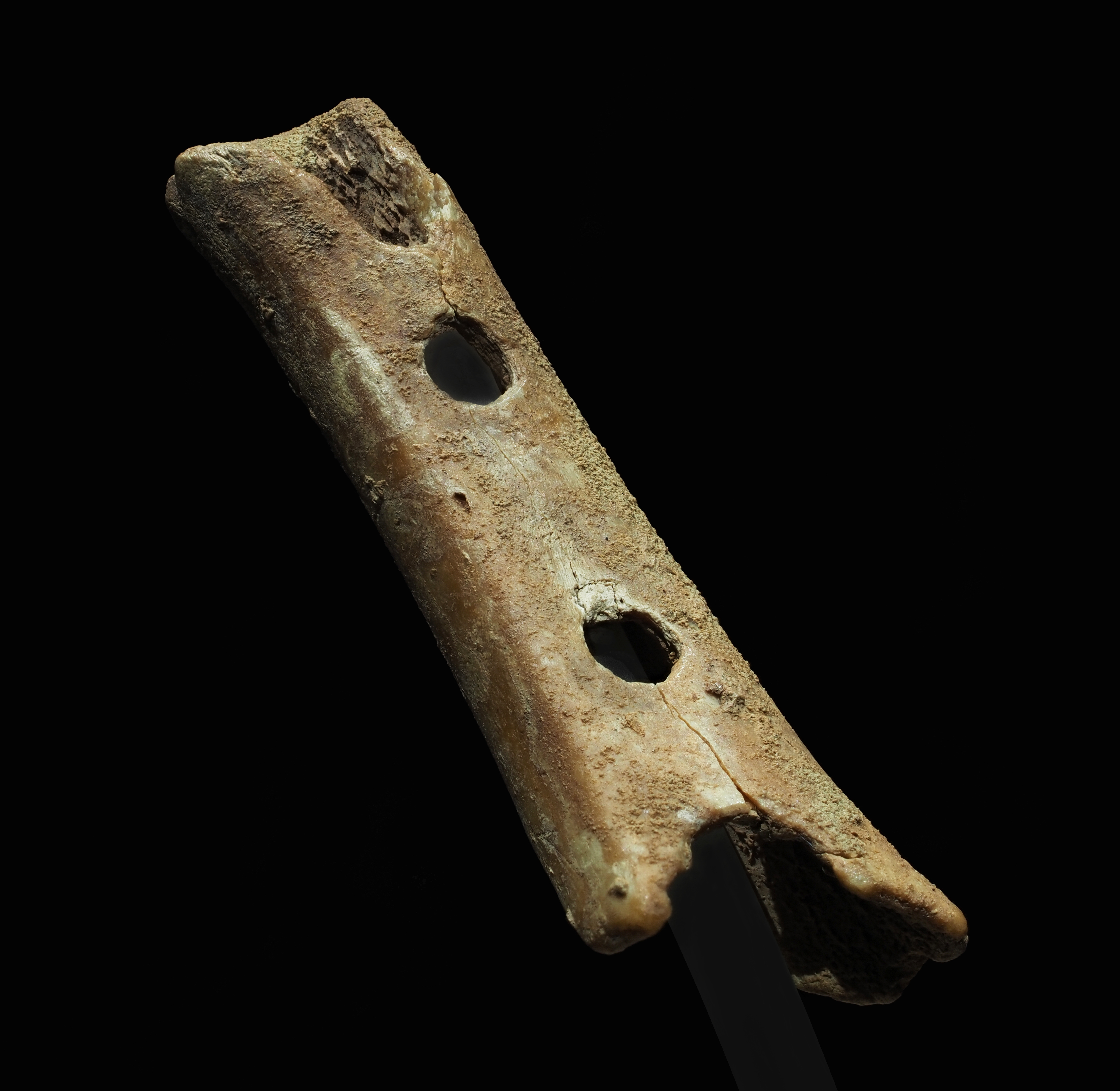
The National Museum of Slovenia presents this cave-bear bone as the world’s oldest known musical instrument, about 60,000 years old.
Its interpretation as an instrument remains debated.
Photo: Petar Milošević · Source · CC BY-SA 4.0. Photograph unchanged.
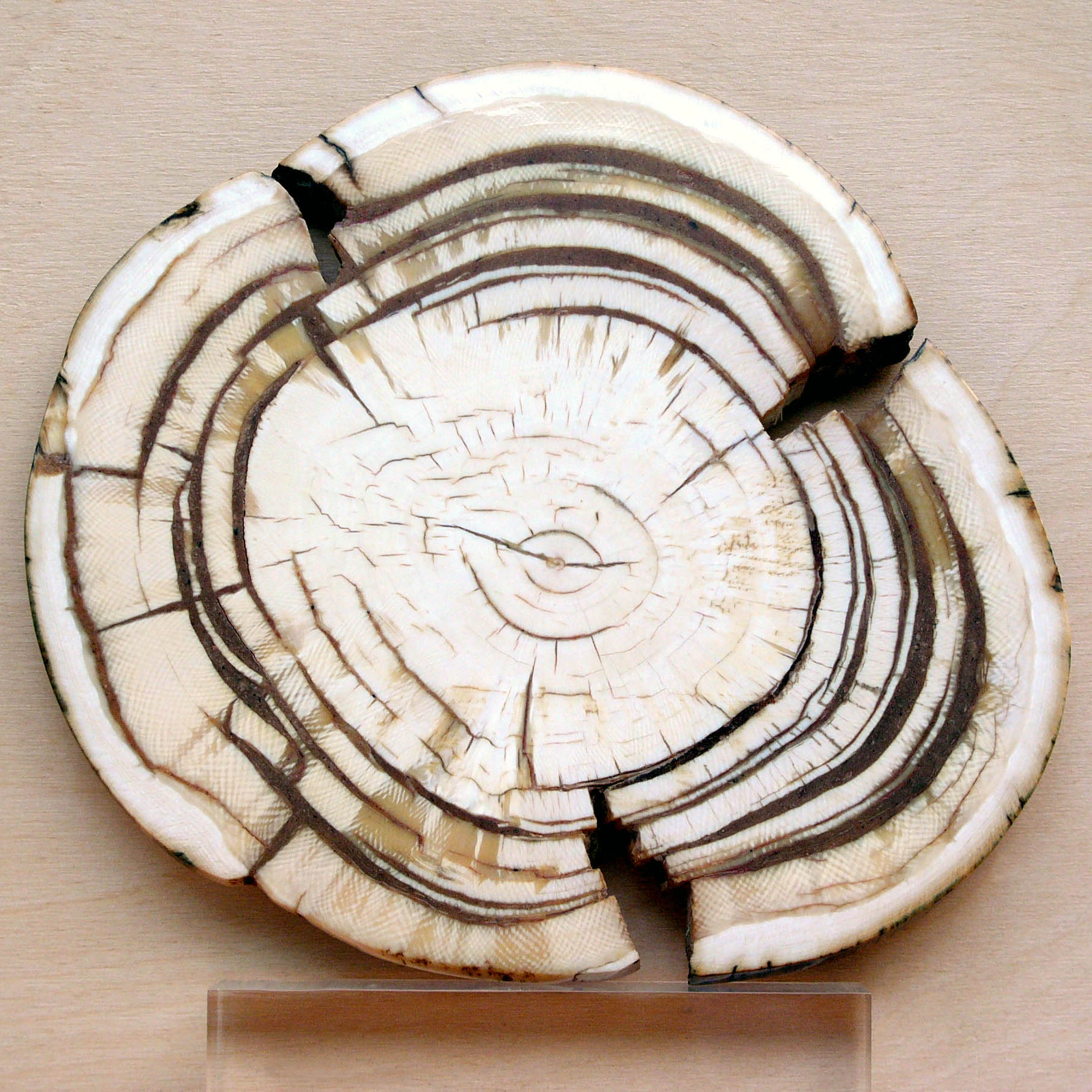
A tusk cross-section from Siberia. Our Ivory cream, #F2EEE9, was sampled from the pale center in the supplied photograph’s screenshot.
The sample reflects the photograph’s lighting and color.
Photo: Hannes Grobe · Source · CC BY-SA 2.5. Photograph unchanged.
#F2EEE9Ivory cream carries through light pages and the logo, text and icons on dark backgrounds.
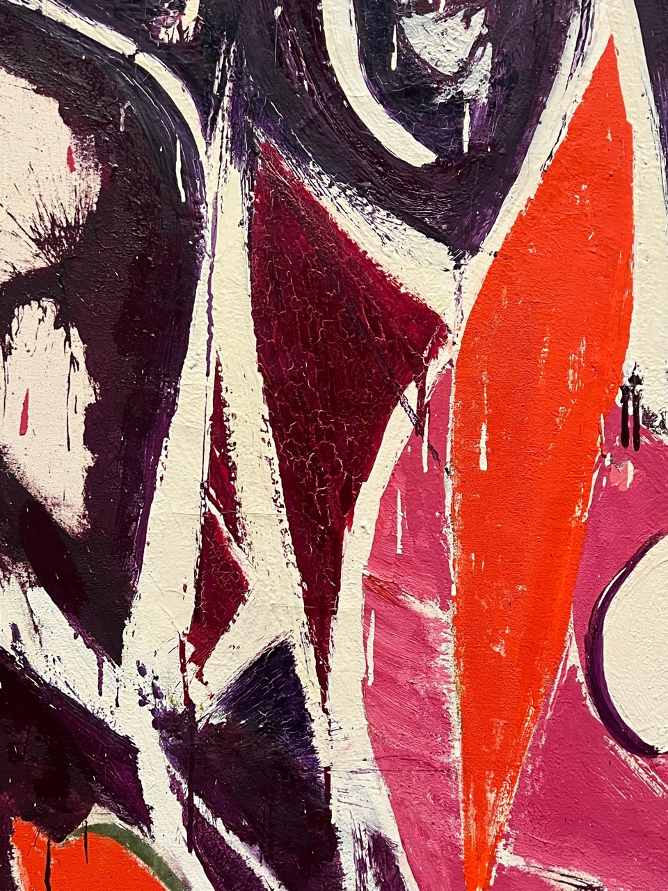
The cream passages, dark brushwork and vivid orange in Lee Krasner’s painting were the starting reference. Mezaj translates that relationship into a light ground, strong dark ink and a small amount of orange.
Charcoal became the reading color and dark-page ground. Ivory cream from the mammoth photograph became the final light ground. Vermilion carries the painting’s bright accent into small graphic details.
#1D1C1AVermilion#EF4428
The main screen colors interpret the painting; burgundy comes from the selected detail. Orange control fills are darker versions of vermilion, adjusted for readable Ivory cream labels.
The identity on things we wear, use and bring into everyday life. Let the material shape the mark.
AI-generated merch concepts, not yet for sale. Colors, materials and finishes are directions to develop with makers.
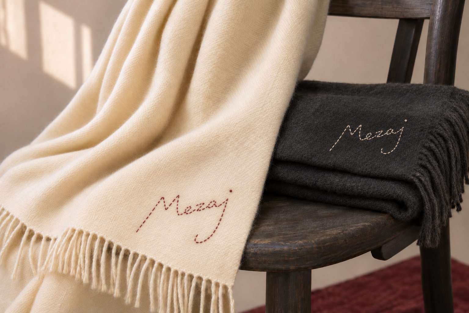
A few simple stitches follow the signature’s shape. Keep the lettering light and open, with small differences in the curves and stitch lengths.
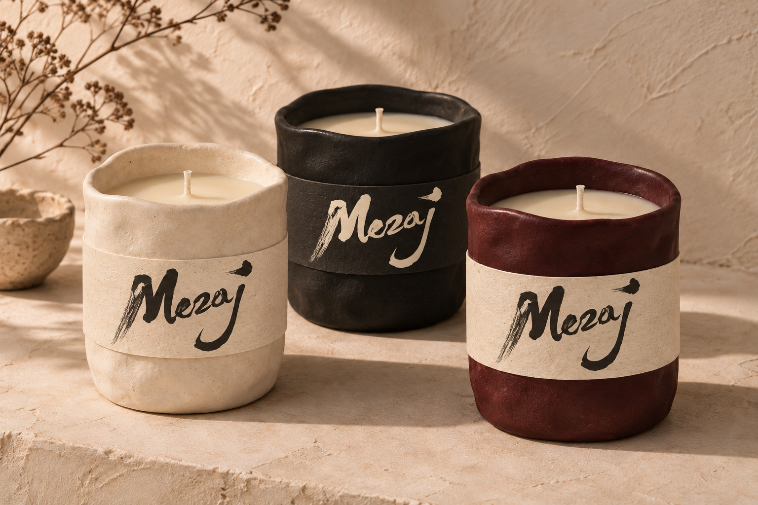
Softly uneven ceramic vessels, simple paper labels and the Mezaj brush signature. Keep the material visible and the label quiet.
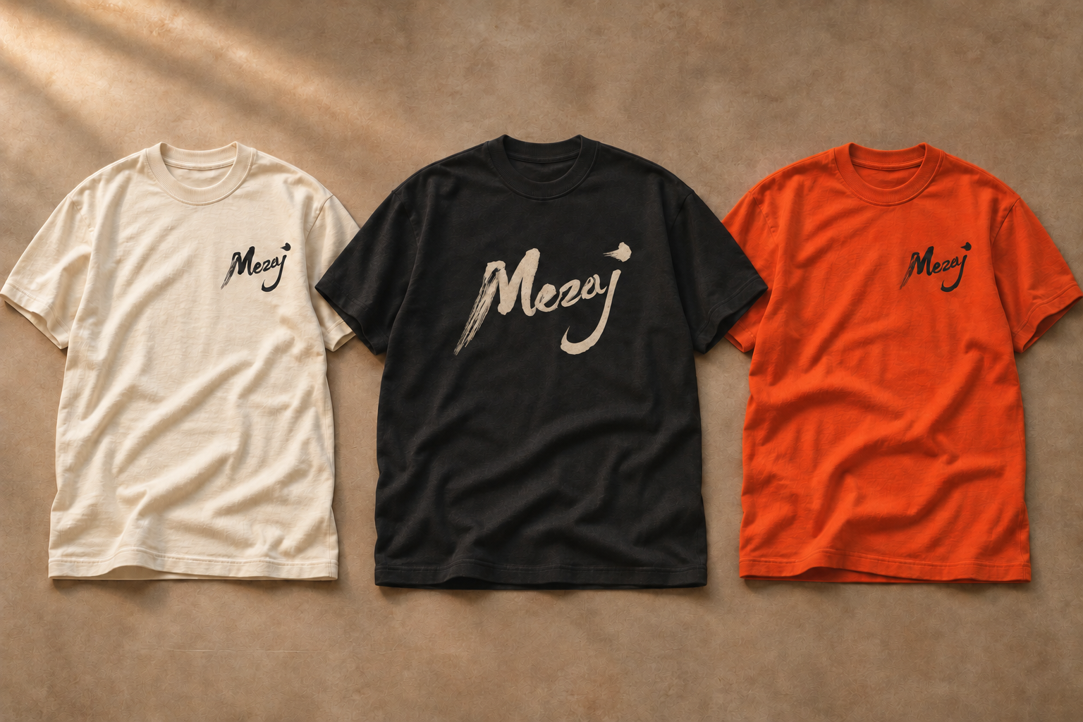
A small mark over the heart, or a larger centered signature. Just the logo, with room around it on the fabric.
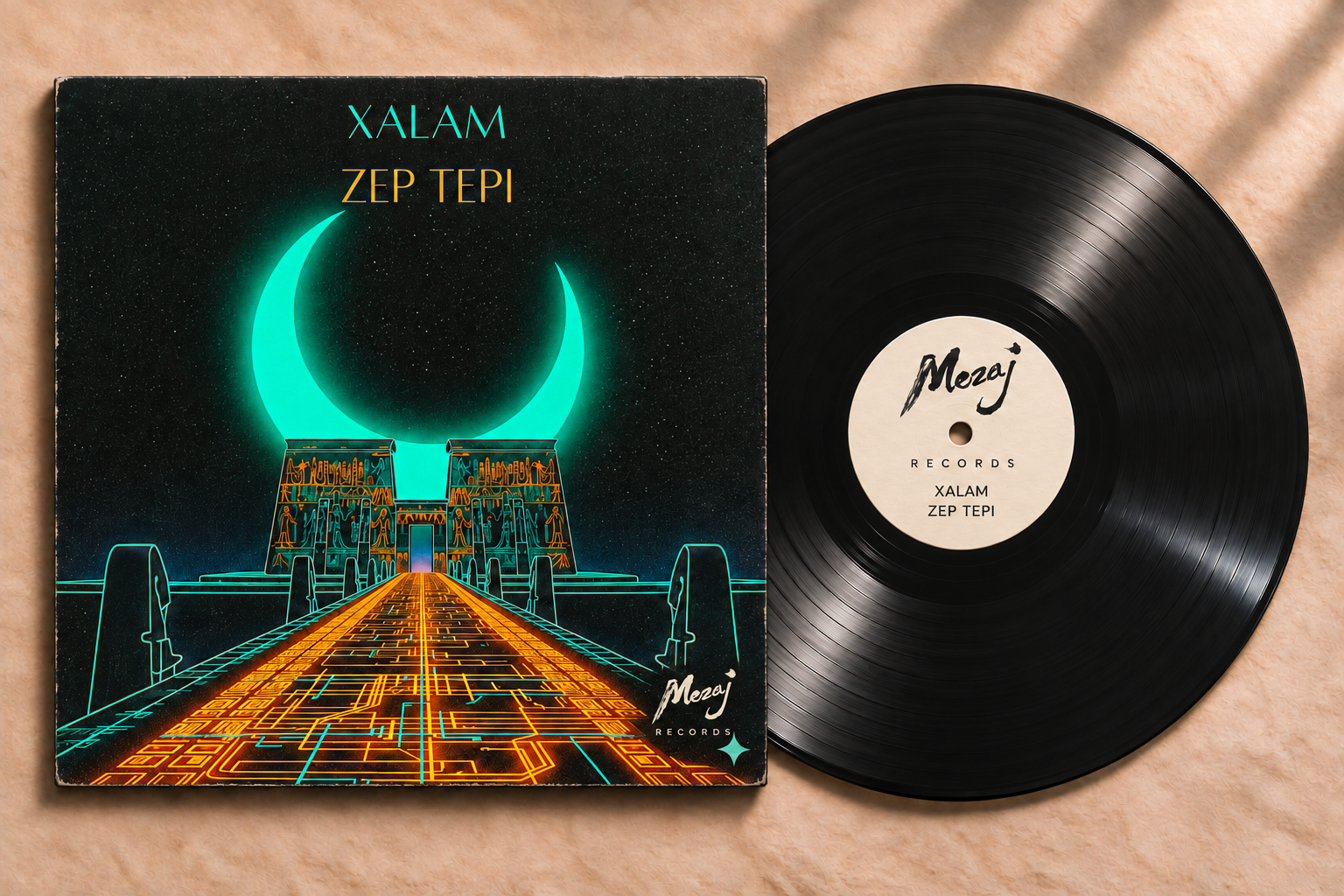
The artist’s Xalam / Zep Tepi cover, with a small Mezaj imprint at the bottom right of the outer sleeve and an Ivory cream center label. A concept for the label’s identity in print.
Printing uses the brush artwork. Hand stitching simplifies it into a fine line, following the letters’ shape and slant. Let each example vary a little in its curves, spacing and stitch lengths.
For promotion, pair a whole-object photograph with a close view of the wax, weave, thread or record label. Give the logo room, preserve the artist’s artwork and credit the makers when the collection is developed.
This logo trial uses the newly supplied hand-painted Mezaj signature. Keep its broad M, dry-brush entry, connected lettering, dot and full j.
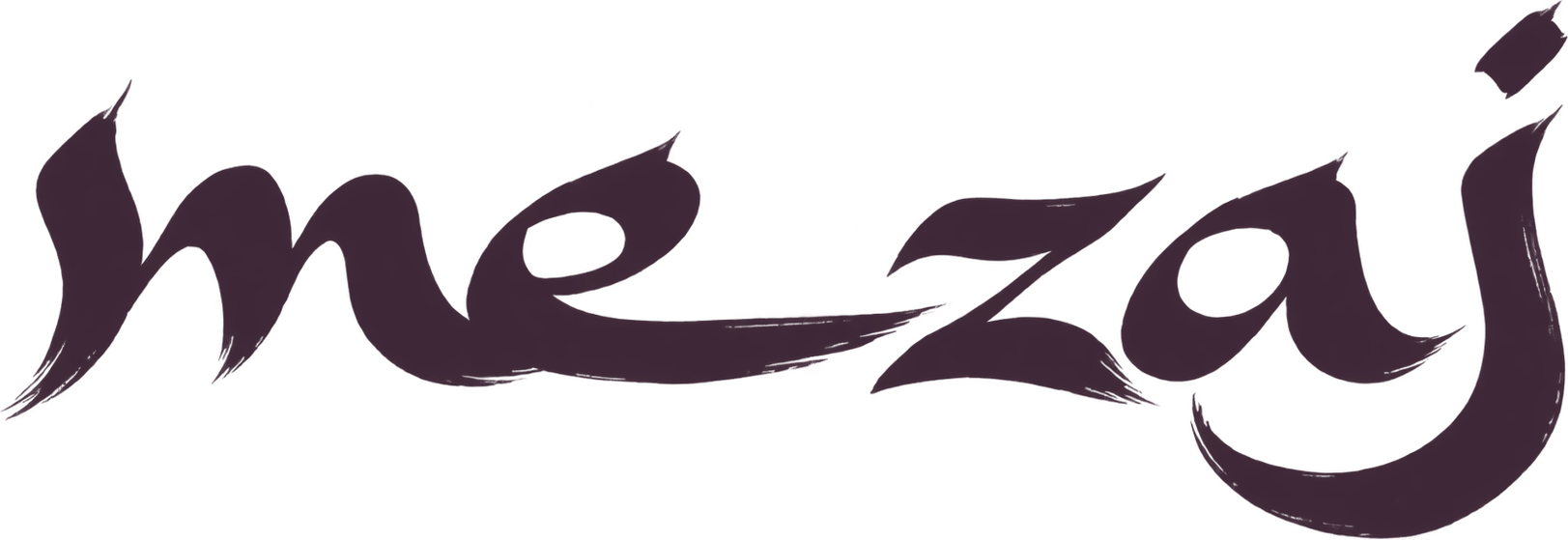
For print and digital use, scale it uniformly. Don’t straighten the letters, crop the j, fill the brush openings or add a shadow.
Use a plain cream or charcoal background. Keep orange accents separate from the signature so the brushwork remains clear.
The home-page signature is 304px wide on desktop and 216px on phones. It scrolls away at full size; a small full signature stays at the top left from page load. For new uses, start at least 128px wide and leave roughly one fifth of the mark’s width clear around it. Check the real size before printing. Hand stitching has its own treatment in the Merch section above.
 Use the full brush signature in the compact header and at the top left of event pages. Both return to the top of the homepage. Keep the M in the browser icon. Event headers use solid Ivory cream with dark ink, even above dark event artwork. The full signature appears in the navigation menu. The favicon is near-black on Ivory cream, so it stays clear in light and dark browser tabs. Preserve its textured entry stroke; don’t substitute a typed letter.
An artist-curated label supporting musicians and the communities behind their music.
Set RECORDS on a straight, horizontal baseline in small, widely spaced DM Sans capitals below the full brush signature, following the record-label reference. The letters are outlined artwork, so their spacing stays consistent while fonts load. Keep the original signature at the same size and position across Events and Music, and leave the mark unchanged on hover. On Music, use this lockup once in the masthead, beneath the primary navigation. The page opens with the large heading “Artist-curated, community funded music.” The small full signature stays in the top-left navigation from page load while the full signature scrolls away. Use charcoal on Ivory cream, and Ivory cream on charcoal.
Color values and practical guidance for the website and business tools.
Palette values Business tools UIIvory cream · #F2EEE9 is the adopted light color. See it in light and dark interfaces.
Sampled from the pale center of the supplied mammoth ivory photograph.
Our main text, dark pages and quiet, high-contrast panels.
Our primary highlight. Active navigation uses deep vermilion on Ivory cream and a lighter tint on charcoal. Orange-filled controls use Ivory cream labels.
A secondary color from the supplied dark-red detail. Use selectively for supporting accents, such as the funding total, candle vessels and stitched thread.
#B4442F#E5E0DA#2B2926#F2EEE9Search fields and dropdown highlights use warm stone surface #E5E0DA with Ivory cream. Browse selections use charcoal with Ivory cream, reversed in dark mode. Orange controls use Ivory cream #F2EEE9 for labels and icons in both themes. Their fill is #B4442F. Reserve bright vermilion for graphic accents.
Active navigation uses deep vermilion #A73622 on Ivory cream. On charcoal, use vermilion mixed with 25% Ivory cream (#F06F58). Logos, icons, inactive links and supporting copy use Ivory cream #F2EEE9. Burgundy is a secondary accent; its dark-page tint is #AF9193. Keep links underlined.
Working contrast targets: at least 4.5:1 for ordinary text and 3:1 for meaningful icons and control states. Ratios are calculated from solid sRGB colors, not a full accessibility audit. W3C text guidance · Control contrast
A practical workspace for the people running events. White surfaces, blue interaction cues and clear dark text help organizers manage events, guests, teams and reports.
Active tabs, selected controls, focus borders and action cues.
The main workspace, forms and data surfaces.
Quiet navigation and grouped controls.
A light background behind a blue selection border.
Use white for the working area, light gray for grouping and subtle borders around fields. Give forms and tables room to breathe.
Blue shows where you are and what you can do. Pair selections with a border, underline or clear label. Keep reading text dark.
Keep established layouts, clear field labels and consistent controls across event editing, guests, teams and reports.
Reference colors from the supplied management screen. Business blue also appears in the existing product styles. This white workspace keeps its own palette when the surrounding brand guide changes theme or cream.
Preserve the familiar event page, with the compact Mezaj M, DM Sans and an Ivory cream ground beneath its flyer colors.
The preview uses the original public event markup and styles, with the compact M at the left on desktop and mobile. Tickets continue through the existing checkout. Production Viewcy is unchanged.
The public Tools page introduces the products and uses Mezaj Ivory cream. These colors belong to that presentation layer. The back-office workspace uses the blue-and-white system above.
| Role | Light | Dark |
|---|---|---|
| Page & fields | #F2EEE9 | #1D1C1A |
| Text & icons | #1D1C1A | #F2EEE9 |
| Inset surfaces | #E5E0DA | #2B2926 |
| Supporting text | #665C51 | #C8BFB3 |
| Primary action | #1D1C1A | #F2EEE9 |
| Primary action label | #F2EEE9 | #1D1C1A |
| Orange fills | #B4442F | #B4442F |
| On orange | #F2EEE9 | #F2EEE9 |
Showing Ivory cream #F2EEE9. Dividers use the text color at 20% opacity. Browse selections use charcoal with Ivory cream labels, reversed in dark mode. Selected navigation uses deep vermilion #A73622 on cream and its lighter tint #F06F58 on charcoal. Burgundy #4B0513 remains a secondary accent; supporting links use the page text color. Orange fills use Ivory cream for labels and icons.
Embedded demonstrations retain the product colors below. These are reference colors for those screens.
White and plum reverse between light and dark. Validation messages use pink.
#FFFFFFDark surface / light ink#281D26Error on light#CD0D50Error on dark#FF8CB5Ivory cream pairs with plum. Actions are orange in light mode and pale blue in dark mode. Seat categories keep their labeled colors.
#3D2635Light-mode action#B4442FDark-mode action#9BB3FFNative dark screens use white text and pink actions. Green and red accompany explicit result messages and icons.
#0B0B0CAction#D60B52Check-in success#6AD13ADuplicate ticket#D83A31Payment success#4CD964Singularity screenshots and familiar phone interfaces retain their source colors. Preserve those captures and the artists’ imagery. View the public Tools page.
DM Sans, loaded as “Mezaj Sans.” Regular 400 for reading; semibold 600 for names, titles and key amounts.
Mamar Kassey · Music from Niger
Every ticket funds music around the world.
Events · Music · ToolsPage-opening display headings use their established responsive style, separately from this fixed content scale. Supporting text and timestamps use a readable muted color. Preserve names and diacritics; use an appropriate script font where DM Sans does not cover the language.
Navigation stays quiet enough for the work to lead. Controls should be easy to recognize, read and use.
Ivory cream · #F2EEE9
Participation is patronage.
Every ticket funds music around the world.
Ivory cream is the shared light color. Light shows it as the page surface; Dark shows it in the logo, text, icons and selected controls. Burgundy labels and inward chevrons mark the current section.
Vermilion text and inward chevrons mark the active Events, Music or Tools section. Use the text characters > and < in the same font, size and weight as the label. Use deep vermilion #A73622 on Ivory cream and a lighter vermilion tint #F06F58 on charcoal; keep inactive labels neutral. Burgundy remains a secondary accent. The header stays cream or charcoal, with the signature on a clear field.
List / Map and other pill selections use charcoal with Ivory cream labels in light mode, and cream with charcoal labels in dark mode. Music matches the Events search surface: a leading search icon, the same neutral fill, height, spacing and underlined dropdown. Choose Videos or Artists in that dropdown; on narrow screens, the query sits above it. Deep orange controls use Ivory cream for text and icons in both themes. In the main menu, Create an event uses bright vermilion #EF4428 with dark ink #100D0F for its label and arrow. Tools and Help headings use the same vermilion, and both groups start expanded on mobile. Main actions can use solid cream or charcoal. Use Ivory cream for the logo, search, menu and notification icons on charcoal. Unread notifications use an orange dot. Dropdowns share the Events search treatment: cream or charcoal menus, neutral hover highlights, a checkmark for the selected choice, and 16px regular labels. Use underlined choices in filter rows and outlined fields in forms, with the same arrow, focus outline and spacing.
Dark orange markers with Ivory cream for numbers in both themes. Music uses the globe only, with no map switch. Selection and recent additions use rings as well as color.
Keep transitions brief, honor reduced motion, and retain a visible keyboard focus indicator. Reserve space for selection markers so labels and the logo stay in place.
Be warm, direct and specific. The platform is the host; the artists and communities remain the authors.
Preserve posters and performances in their original proportions. Show the artist, place and organizer where they matter. Don’t recolor someone’s work to match our palette.
“Participation is patronage.” invites people in. “Every ticket funds music around the world.” explains the connection. Funding figures must come from current data.
“Create an event.” “Meet the fund.” “Show us your room, your program, your plans.” Use direct actions and concrete language. Prefer labels such as “Playlists.” Cut generic invitations and filler; let the work provide the evidence.
Spell the name Mezaj, with a z, throughout page copy, navigation, accessibility labels and page titles. The Music heading pairs the Mezaj signature with RECORDS. Preserve artists’ names and original-language quotations.
The current logo is a prepared raster study using the supplied calligraphy, with AI-assisted background removal. It is not a finished vector master. Preserve this artwork; prepare a faithful vector master for fabrication rather than auto-redrawing it.
This edition consolidates the current prototype’s choices. New spacing, size and contrast guidance are working standards to test in use. Update the guide when a brand decision changes.